Portfolio optimisation and brand guideline creation.
Background
Clinell is a legacy brand that’s nearly 20 years old, claiming widespread recognition and loyalty within its primary market, the NHS, where Clinell products can be found in 9 out of 10 hospitals. The flagship product, Universal Wipes, is a class leader with superior technical performance backed up by extensive evidence and therefore commands a significant price premium compared to the competition.

The Challenge
Over the years many new product families and SKUs had been created under the Clinell brand with little strategic thought or brand governance. This led to an unwieldy and inconsistent use of brand elements, packaging and design conventions.
In addition, the aftermath of COVID resulted in an influx of newer, cheaper competitors on the market and extremely stretched budgets across the NHS. Many senior Infection Prevention and Control (IPC) nurses began leaving the profession as a result of burnout and were replaced by more junior IPC nurses who did not have the same brand loyalty to Clinell.
Having relied on the intrinsic knowledge of salespeople and IPC nurses for many years, the existing brand materials were out-of-date, inconsistent and not understood by new members of the Sales Team, and the business was at risk of losing several key accounts.
The Solution
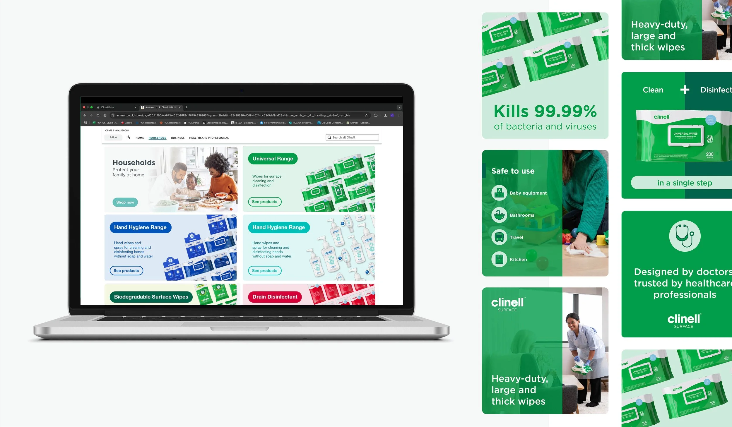
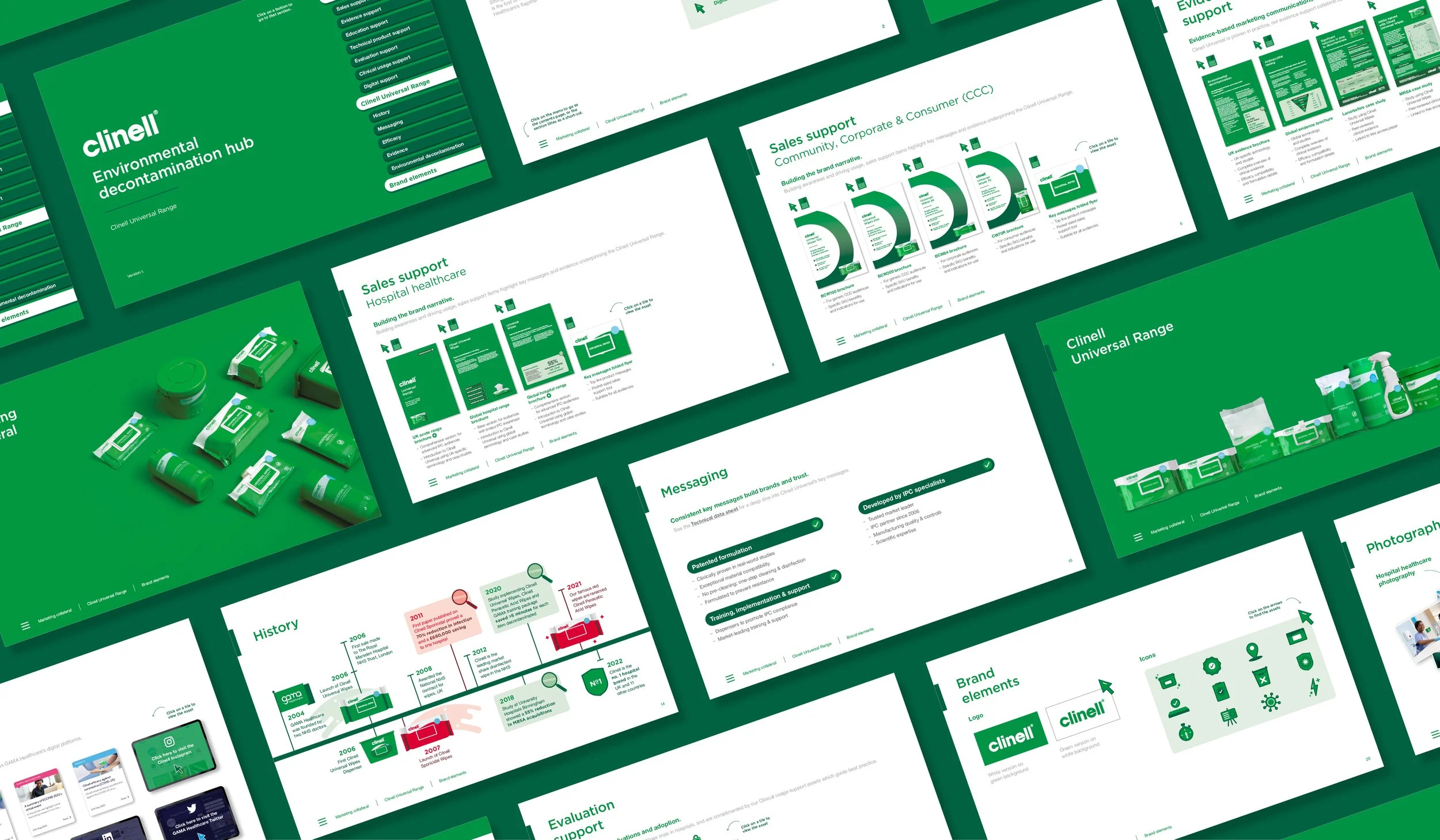
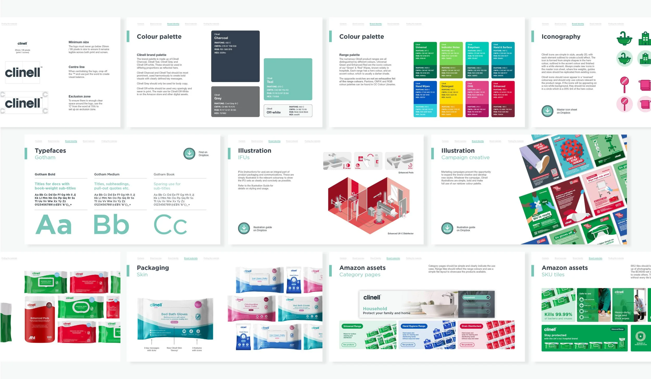
Along with updated messaging, I rolled out a consistent look and feel for all Clinell products and their corresponding sales materials, with emphasised and accentuated brand marks to create a fresh feel without isolating the current audience. I refreshed the packaging design and made clear distinctions between ranges, to avoid confusion between products and created comprehensive brand guidelines. A clear brand story and consistent look and feel contributed to a 95% account retention rate after year 1.