Development of distinctive brand illustration style
Background
In 2024 HCA UK went through a comprehensive rebrand to better align the brand with the premium private healthcare market in the UK and to bring together numerous separately branded facilities acquired over the years. Many of HCA UK’s brand elements stem from the US counterpart, such as logo and some graphic shapes, but the UK brand differs from the US as the markets and messaging are so dissimilar. The US brand needs to appeal to a broad audience, in a market where healthcare is fully privatised and the emphasis on different services contrasts to the UK.
The Challenge
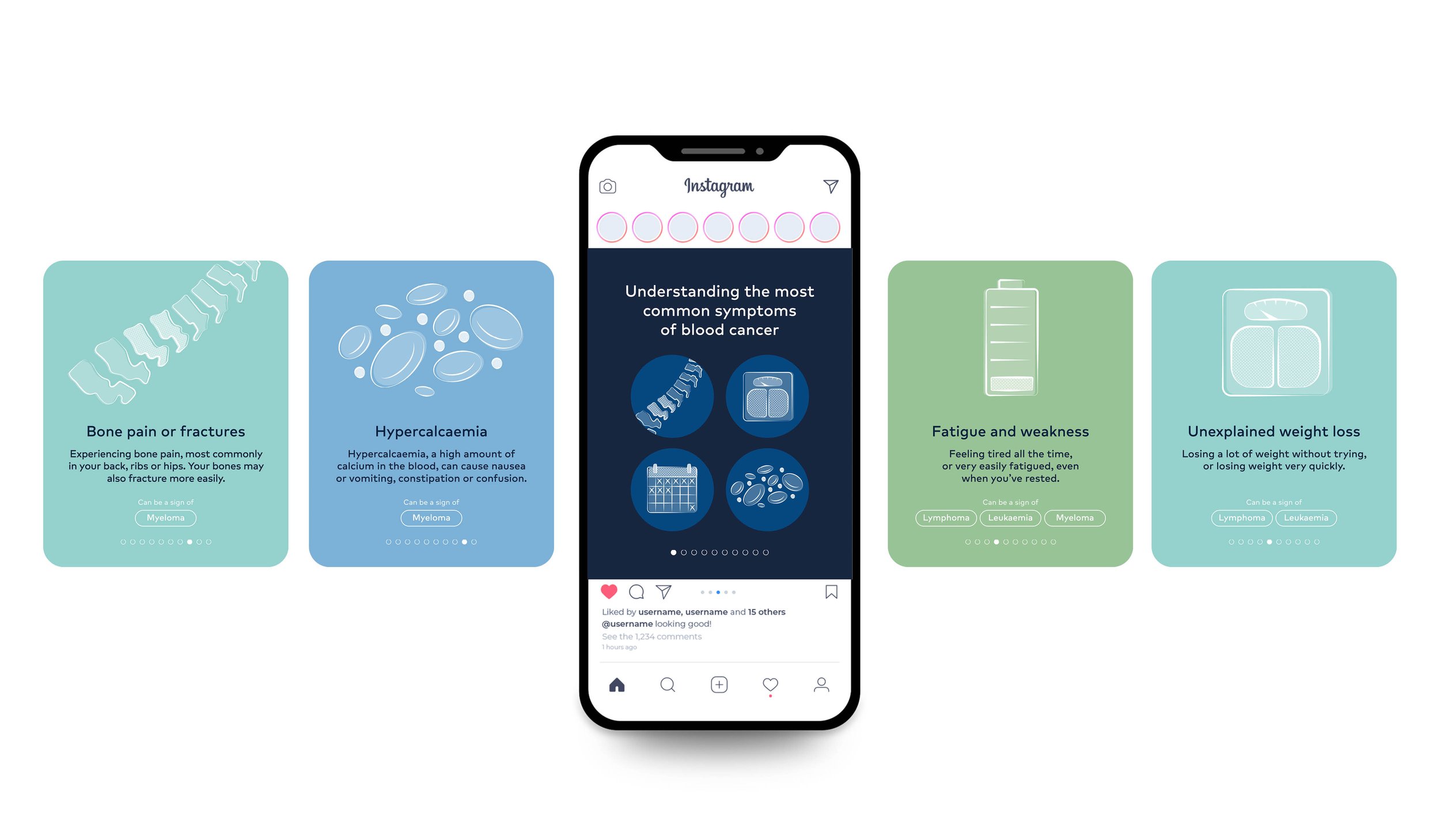
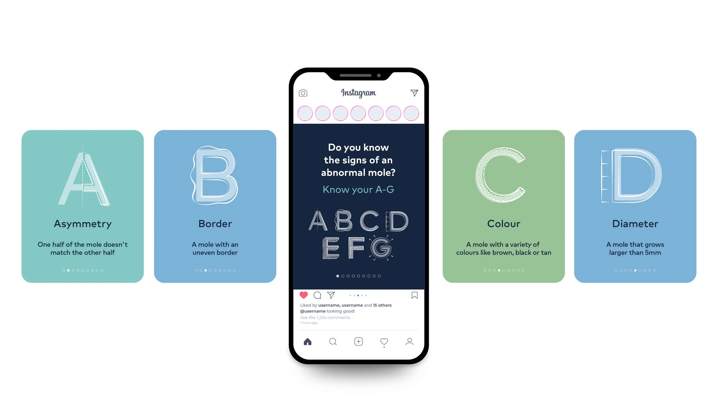
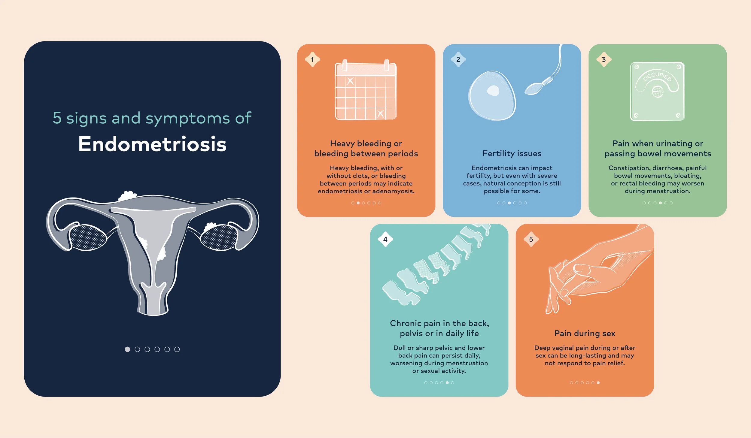
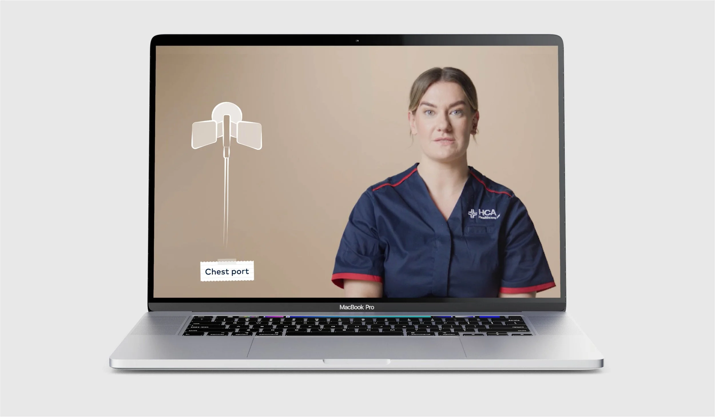
After rolling out the new HCA UK brand, and starting to see it work, it became clear that an illustration style for the UK would need to be developed. The HCA US illustration library was not fit for the needs of the UK market and didn’t align well with the new brand look and feel. In the absence of a specific UK style, a mix of stock illustration was being used and this led to inconsistency and a lack of distinctiveness. This missing link in the brand toolkit became particularly noticeable when the requirement arose for bespoke illustrations needed for a suite of patient information videos.
The Solution
I undertook extensive research into similar or comparable brands and evaluated their approach to illustration and how they used it. I then investigated the ways that our brand values, behaviours and tone of voice could be translated into illustration styles principles. This led to an intentionally simple, impressionistic style, with a hand-rendered feel that could, crucially, be scaled easily and utilised by all Studio team members. The restrained use of colour interplaying with opacity and line effects has resulted in an elevated feel that aligns with the brand.
The reception from the business has been so positive that illustration is now being used more widely across different assets and the information video has been very well received by patients.