Brand expansion and collateral design.
Background
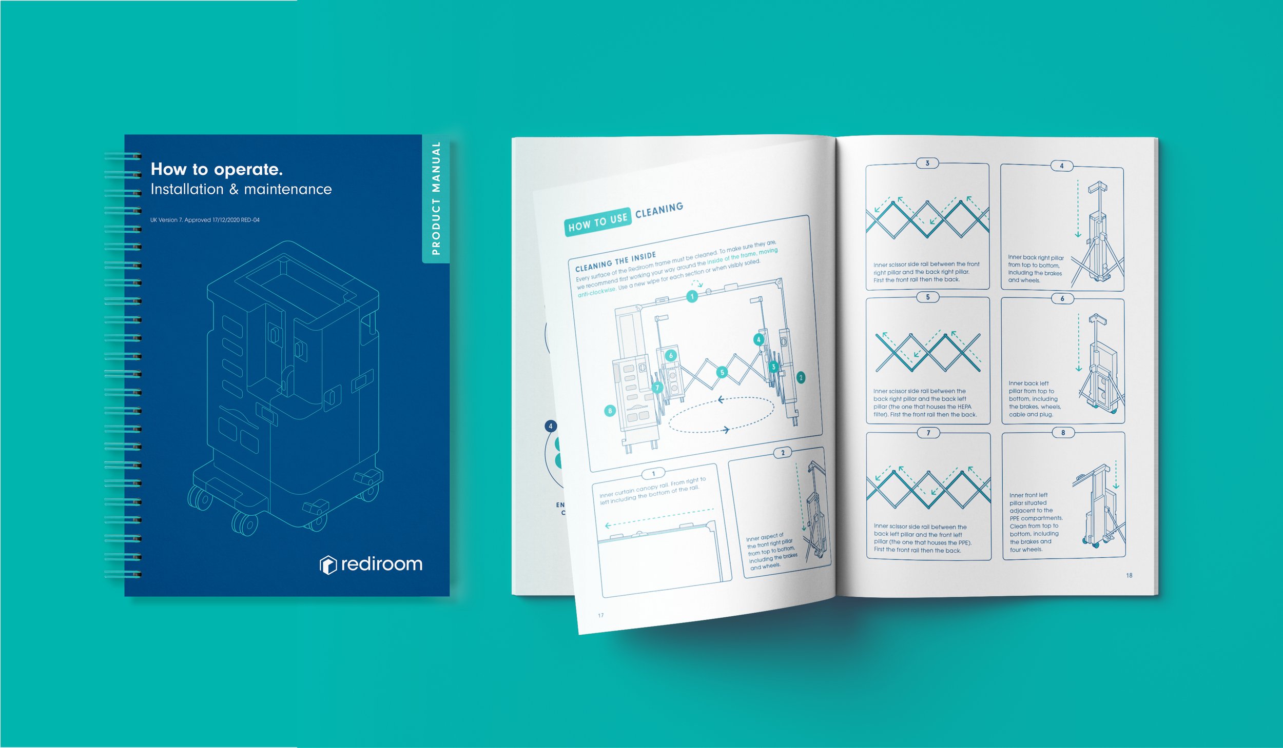
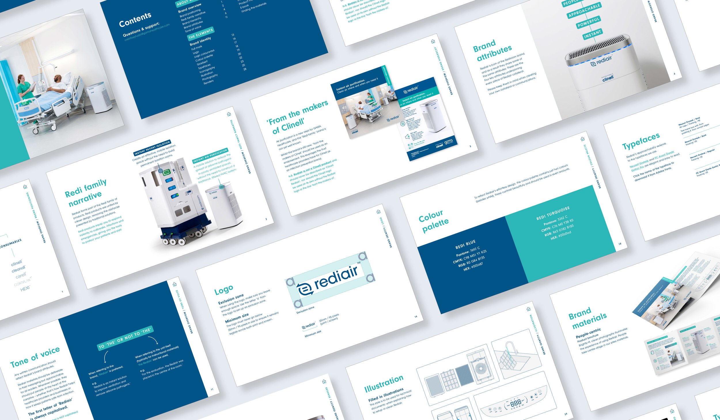
Rediroom started out as a novel concept - a mobile, air-filtered isolation room that hospitals can deploy anywhere to isolate an infectious patient in 5 minutes. It was launched in 2020 and used widely during the COVID pandemic, notably in the London Nightingale Hospital, with sales of over £6m and an ongoing consumables spend of £1.5m per annum. Its unique and innovative design earned Rediroom a prestigious Red Dot Design award amongst others. Rediroom was established as a brand that stands for innovation and high quality, finding cutting-edge solutions to problems facing healthcare.

The Challenge
Rediair, an air filtration unit, was developed as a line extension in late 2021. It would use the same air-filtration technology to allow hospitals to improve air quality in poorly ventilated areas, aimed at reducing the spread of pathogens in airborne particles. However, by the time of launch, many cheaper, generic air purifiers had appeared on the market. Rediair filters 10x more particles than a domestic air purifier, and its price reflects its higher performance.
The Solution
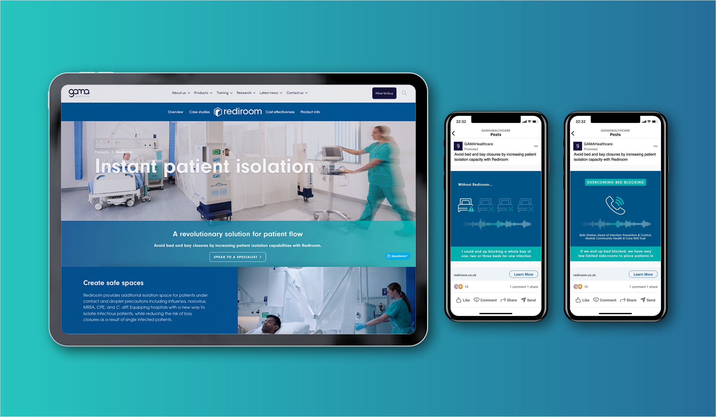
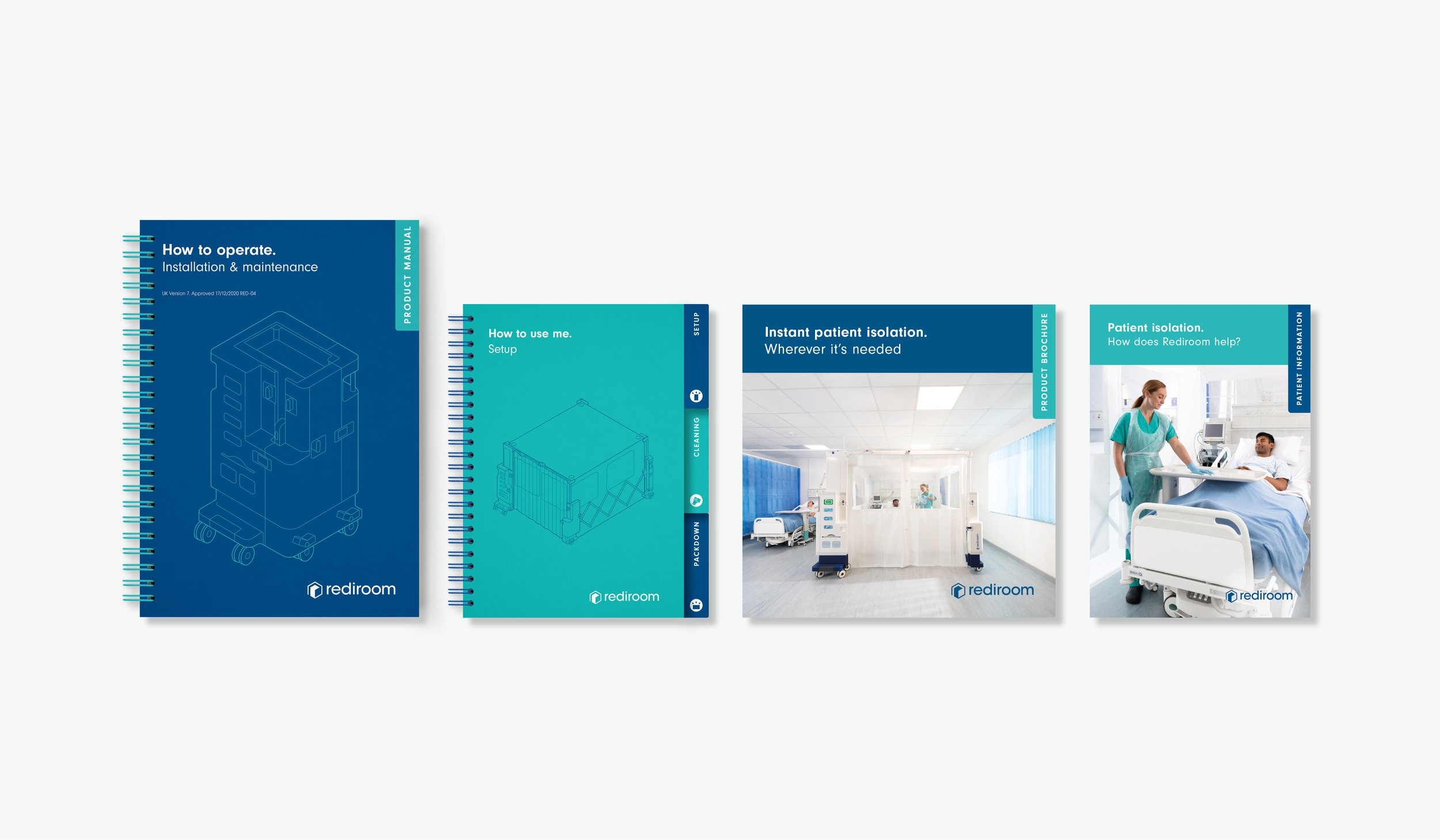
I developed the existing Rediroom branding to accommodate Rediair, creating a complementary logo and a suite of icons and product illustrations, which spread over the new collateral. In collaboration with a CGI & Render studio, a promotional video was created with my art direction and graphic design support, which created distinctiveness for Rediair as a premium, expertly engineered product designed for healthcare from the ground up. By expanding the already successful Rediroom brand, we were able to leverage brand equity and give Rediair instant credibility in the market, especially against cheaper, generic competitors.
By the end of year 2, we generated £1.5m of sales and have established Rediair as a leading air filtration brand within the healthcare sector.